New Player Controls: 10-Second Skip, Bigger Buttons and a Subtitle Panel
August 9, 2026 · 6 min read
We've been working on the EVStream player quite a bit lately, and this update brings together several changes we've wanted to make for a while.
The control bar has been rebuilt, 10-second skip buttons are finally here, the controls are much easier to use on larger screens, and subtitles now have their own panel. We also fixed an annoying full-screen issue that could make some of the controls stop responding.
Everything mentioned below is already live on the player, so there's nothing you need to install or enable.
We rebuilt the control bar
Our old control bar did the job, but everything was squeezed into a small floating row at the bottom of the video. The more features we added, the more obvious it became that we needed something better.
So we rebuilt it.
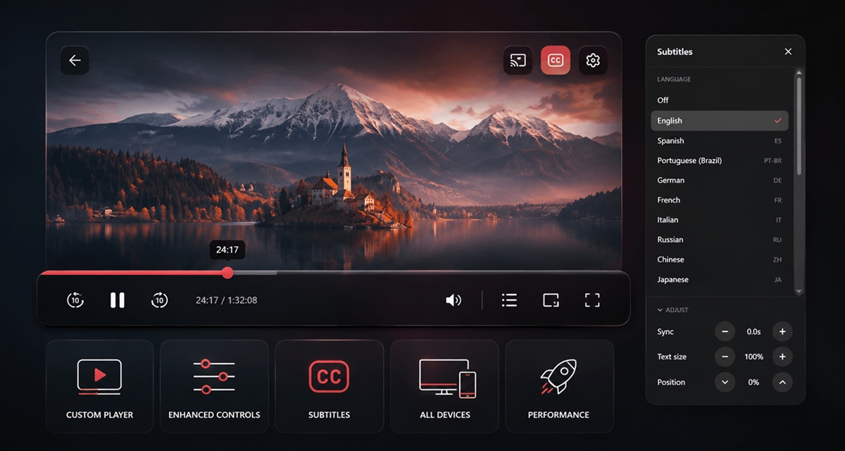
- The controls now run across the bottom of the player instead of sitting inside a floating box. We also added a dark gradient behind them so they're easier to see without covering too much of the video.
- The scrubber is much easier to use now. The part you've already watched is filled in red, the round handle can be grabbed anywhere along the line, and the time remaining sits on the right.
- Controls are grouped. Playback on the left, what you're watching in the middle, and settings (subtitles, speed, picture-in-picture, full screen) on the right, with full screen last where your hand expects it.
Skip 10 seconds, backwards and forwards
This was one of the requests we kept hearing from users: a quick way to jump backwards or forwards without dragging the timeline. Jump back 10 seconds if you missed something, or jump forward 10 seconds when you want to skip ahead. They show up for movies, series and catch-up TV, anywhere seeking makes sense.
Tapping repeatedly does what you expect. Four quick taps on the forward button moves you 40 seconds ahead, not 10. The bar follows every tap immediately, so you can see where you're about to land while you're still tapping, and the video jumps once when you stop.
There's a technical reason for doing it this way. For movies and episodes, seeking can mean reopening the stream on our servers. If every tap triggered its own seek immediately, four quick taps could result in four requests all trying to move the stream at once.
Bigger buttons that are easier to hit
Every icon in the control bar used to be 16 pixels, on every device, no matter how large the screen. On a laptop it was small. On a TV or a car screen it was almost invisible.
Icons now scale with the screen. On a phone they're 24px, 28px on a tablet or small laptop, and 32px on a large display, sitting inside round buttons up to 48px across. That makes them much easier to hit on touchscreens, especially on larger displays.
Before
16px, whatever the screen
Now
up to 32px on a large screen
Full screen: everything is clickable again
This one was simply a bug. In full screen, the subtitles and playback-speed buttons weren't working properly. You could click them, but the menu wouldn't appear. In some cases, the rest of the control bar would then stop responding until you clicked somewhere else.
The cause was technical. Those menus were being drawn outside the element the browser had put into full screen, so they opened invisibly behind it. Both menus now open inside the full-screen view where they belong, and skip, play, volume, speed, subtitles and picture-in-picture all work there.
Subtitles moved into a proper panel
Subtitles used to live in a small dropdown attached to the CC button, with Sync and Size hidden behind tabs that were pretty easy to miss. It was getting cramped on desktop, and on phones it was even worse.
Now when you click CC, the subtitle settings open in their own panel. Languages are at the top, with Sync, Text size and Position underneath.
Language
⌄ Adjust
ResetWhat changed inside it:
- Language names are easier to read. Instead of only showing something like PT-BR, you'll see Brazilian Portuguese, with the short code still shown on the right.
- Sync, Text size and Position are now together in one place instead of being split across tabs.
- You can hold the + or − buttons instead of repeatedly tapping them when you want to make a larger adjustment.
- There's also a Reset button that puts Sync, Text size and Position back to their defaults.
- If you don't use the adjustment controls often, you can collapse that section and leave more room for the language list. The panel remembers that choice for the rest of your visit.
New: move subtitles up or down
We've also added something we didn't have before: subtitle positioning. Some films burn their own captions into the picture, some scenes have on-screen text exactly where subtitles land, and some people simply prefer them higher up. Position moves the subtitles up or down by 1% of the screen height per press, so you can move them to a position that works better for whatever you're watching.
The existing automatic positioning still works as before. On a letterboxed film, subtitles already sit just above the picture rather than floating in the black bar below it, and your adjustment moves them relative to that, so it keeps working when you switch to a film with a different shape.
Your subtitle settings are remembered
Text size and position are saved on your device, so you don't have to set them again every time you start another movie or episode.
Sync is different, so we don't save it. A timing adjustment usually belongs to one specific subtitle file. Carrying that same offset into the next movie or episode could make perfectly synced subtitles appear out of sync.
Better on phones
On a phone, the browser's own address bar covers the bottom of the page, and the control bar used to be pushed well up from the bottom edge to avoid disappearing underneath it. We've changed how the player handles the browser's visible area, so the controls can stay at the bottom without getting hidden behind the browser UI.
The subtitle panel adapts too. On a wide screen it's a panel on the right with the video still visible beside it. In portrait on a phone it becomes a sheet that slides up from the bottom, within thumb reach. In both, the language list is the part that scrolls while the header and adjustment buttons stay put, so even on a phone held sideways, where there's barely any height to work with, the controls can't scroll out of reach.
Most of these changes come back to the same idea: the player should be simple to use. Controls should be where you expect them, easy to hit, and they should behave the same way whether you're in full screen or not.
Try it
All of these changes are live now. If you already use EVStream, just open a movie or episode from the connect page and you'll see the new controls right away. Try the 10-second skip buttons, open the CC panel, or switch to full screen and see how it feels.
If something doesn't behave the way you expect, especially on a phone or car browser, let us know at [email protected]. Screens and browsers can behave differently, and user reports really help us catch things we can't reproduce on every device.
In fact, several of the changes in this update started with feedback from people using EVStream.
Thank you for using EVStream.app.
Open your Tesla browser and try it today
Charge your car. Stream your favorites.
Launch EVStream.app